Sustainable Farming
Usability Testing


Agrible is a digital platform that provides predictive agronomic forecasts and sustainability metrics generated from farmers' field-level data. This info helps farmers enhance efficiency, create new revenue streams through sustainability programs, and ensure long-term success for the next generations.
Owned by Nutrien, Agrible has a customer success team that supports farmers, assisting them in entering data and ensuring all required information is complete to earn incentives. However, the aim is to enable users to self-serve as much as possible to scale sustainability projects. The platform is designed to be accessible year-round, guiding users through different farming stages: planning, planting, growing, harvesting, and selling.
Problems:
Based on previous research interviewing farmers, operation managers, and customer success team members, we found four key issues that seem to be at the heart of the platform's challenges. These issues could explain why users aren't frequently engaging with the platform and why they need guidance to use it effectively.
1.Awareness
Farmers in the region currently have limited awareness of the sustainability projects available to them and how they can actively participate in them.
2.Data Entry
Entering all the data for the registered fields takes up a lot of time, and farmers/operation managers have to do it over and over again.
3.Progress
Users often struggle with the lack of clear feedback from the system regarding their progress in the process of data entry.
4.Reorientation
Upon returning to the platform, users often struggle to determine their last point of activity, which in turn contributes to a lack of seamless continuous usage.
Solutions:
Our team leveraged its understanding of farming practices and patterns to develop new workflows that have the potential to address many of the existing problems and enhance user efficiency. The underlying assumption was that by resolving key issues related to awareness and user flow, we could boost platform engagement while empowering users to be more self-reliant.
Because most of these design changes were entirely new, we opted to conduct a round of usability tests to evaluate the effectiveness of the new designs, particularly for critical tasks.
Outcome:
This study is just one among several others that we undertook. Through ongoing feedback and iterative improvements, we achieved a remarkable fivefold increase in the number of registered acres in the system, all while maintaining the same-sized customer success team. This success story demonstrates how Nutrien can effectively scale sustainability projects by making the platform more user-friendly and promoting self-service among its users.

Tools:
Miro
Microsoft Excel
Microsoft Teams
Ethnio
Figma
Calendly
My Role:
Senior UX Researcher
Facilitation
Synthesis
Reporting

Team:
Three (3) UX Designers
One (1) Product Manager
Ten (10) Developers

Timeline:
Planning: 1 week
Recruitment: 1 week
Research Sessions: 2 weeks
Synthesis and Report: 2 weeks

Research Goals:
Understand if the flow of the current prototype matches the mental model of growers and how they think about reporting on their farm and field data
Get feedback from current Agrible users to assess if the current design is easier to use compared to the old (live) version
Collect task completion rate
Collect qualitative data on potential design flaws and opportunities
Research Questions:
How easily do users understand what is clickable?
How easily do users understand how to accomplish each task?
Do users understand if they have accomplished the task or not?
How easily and successfully do users find the information they are looking for?
How closely does the flow of the product reflect how the user thinks of the workflow?
Process
>
>
>
>
>
Step 0: Cognitive walkthrough
Started with an initial round of cognitive walkthrough (PURE) with internal SMEs to identify major issues.
Addressed identified problems before testing with real potential users.
PURE cognitive walkthrough findings and scoring
Step 1: Research plan
Collaborated with the design team and PM to pinpoint significant tasks for testing.
Developed a comprehensive research plan, including scenarios, tasks, metrics, and open-ended questions.
Step 2: Recruitment
Randomly selected farmers from the internal participant pool.
Segregated users and non-users of Agrible for diverse feedback.
Invited participants via email with screener questions and scheduling options.
We were aiming for 5-10 participants.
Step 3: Study sessions
Conducted 60-minute remote 1x1 sessions using Microsoft Teams.
Each session was led by a moderator with a note-taker.
Utilized a study spreadsheet for efficient note-taking and synthesis.
Step 4: Synthesis
Held brief post-session discussions for immediate insights and adjustments.
Collated session findings and recorded comments in Miro for comprehensive analysis.

Research plan
Remote sessions via Teams


Synthesis in Miro

Invitation, Screener, NDA and Scheduling in Ethnio

Figma prototype
Step 5: Reporting and Consensus
Presented findings in a report-out session to the broader team.
Prioritized recommendations discussed and aligned with the core team before sharing.
Recorded the report-out session and distributed slides for wider accessibility.

In session note taking in Ecxel

Findings
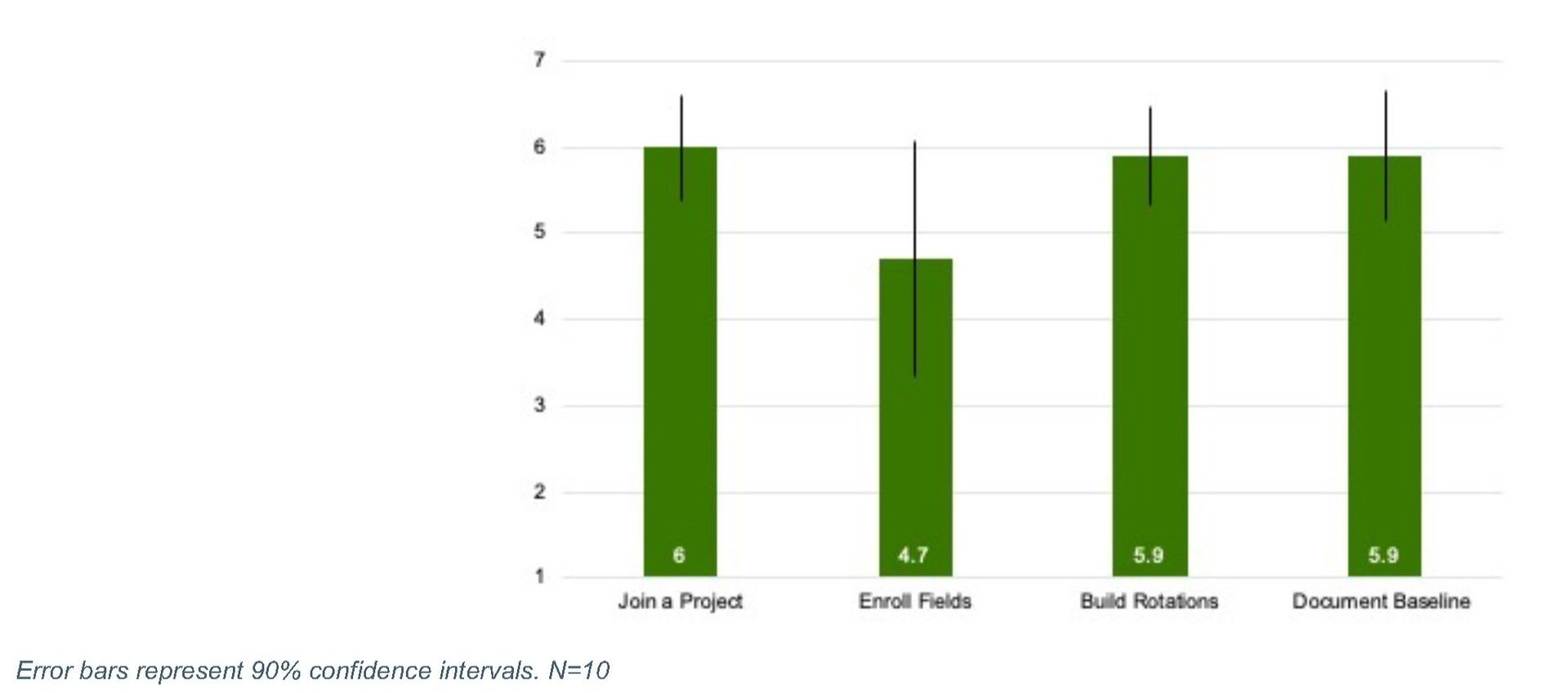
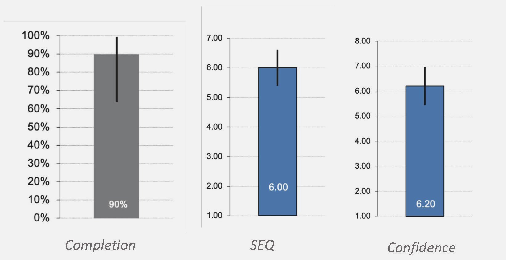
Overall Task metrics
Overall Task Completion:
Task completion rates in our sample were lower than our baseline* for two tasks: Enroll Fields and Build Rotations. A larger sample would help gauge the true variance in our task completion, but initial estimates show that two tasks need the most modifications to make the interface more usable.
* The baseline number was an internally agreed-upon metric.
Overall Task Ease:
Participants rated the tasks relatively easy overall, and Enroll Fields has the lowest mean compared to others.
( 1: very difficult - 7: very easy)
Overall Task Confidence:
This metric was mainly measured in order to identify any potential disasters—where users didn’t complete the task, but they were highly confident that they did. Overall, participants were highly confident in completing their tasks.
(1: not at all confident - 7: very confident)
Overall Ease of Use:
Overall, participants found the prototype fairly easy to use. This rating was higher among participants who have used Agrible in the past.
Agrible users found the difference to be significant since they liked how intuitive the design was, and some features were perceived to be making Agrible much easier to use.


Detailed Findings and Recommendations:
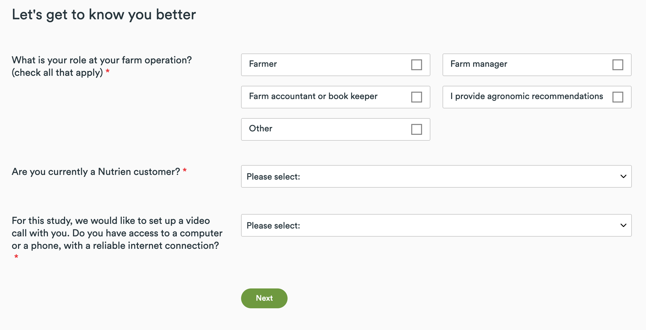
1 - Join a Project
Scenario: Imagine that you somehow heard about a carbon pilot project that Nutrien has launched and is recruiting growers for. You went online and found that you could take a screener to see if you would be eligible. It turned out that you were, and all you had to do was sign up for Agrible (which is Nutrien's sustainability platform) in order to join a project.
Task: You are going to see the screen that shows up after you have signed up for Agrible. What you want to do at this point is join the "Ohio Carbon Project". How would you do that?

Recommendations:
1
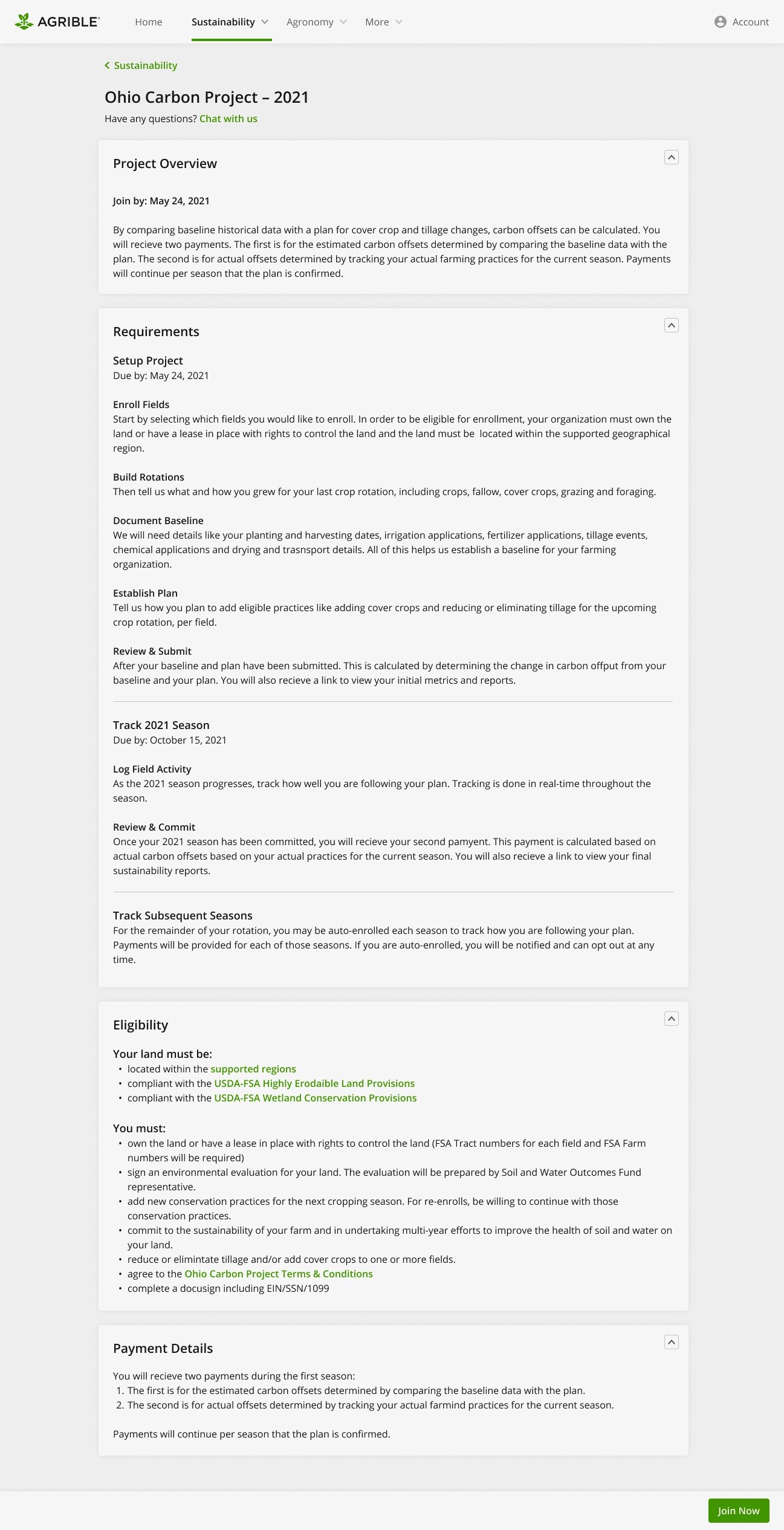
Almost all participants easily found their way to the Ohio Carbon project*.
* but “Learn More” sounded like a scam to one participant.
The cognitive load here is high due to the amount of information. Not all content is clear to participants, and they must spend a long time filtering through the information that matters to them.
Having a button that says “Join Now” confused some participants because they thought they joined the project, even though there was one more step. This part was the main reason that one participant didn’t complete this task.
2
3

5
4
4. There was an interest in being able to print the Terms and Conditions for future reference.
5. Some questions remained unanswered at this point. This includes cost, eligibility, sustainability reports, supported regions, and data.
6. DocuSign is not a known service to everyone.
Most participants completed this task successfully.
This was perceived as an easy task overall.
Reduce the cognitive load by utilizing existing icons to visualize wherever possible.
Present some information in expand and collapse components, so they can explore the areas that they choose, and are not bombarded with lots of information at once.
Change the first CTA to “Get Started” or something similar so it’s clear to users that they haven’t joined the project after the first click.
Differentiate the program overview page from joining the project form.
Provide a "Print" option, so users can print and review before and after they join a project.
6
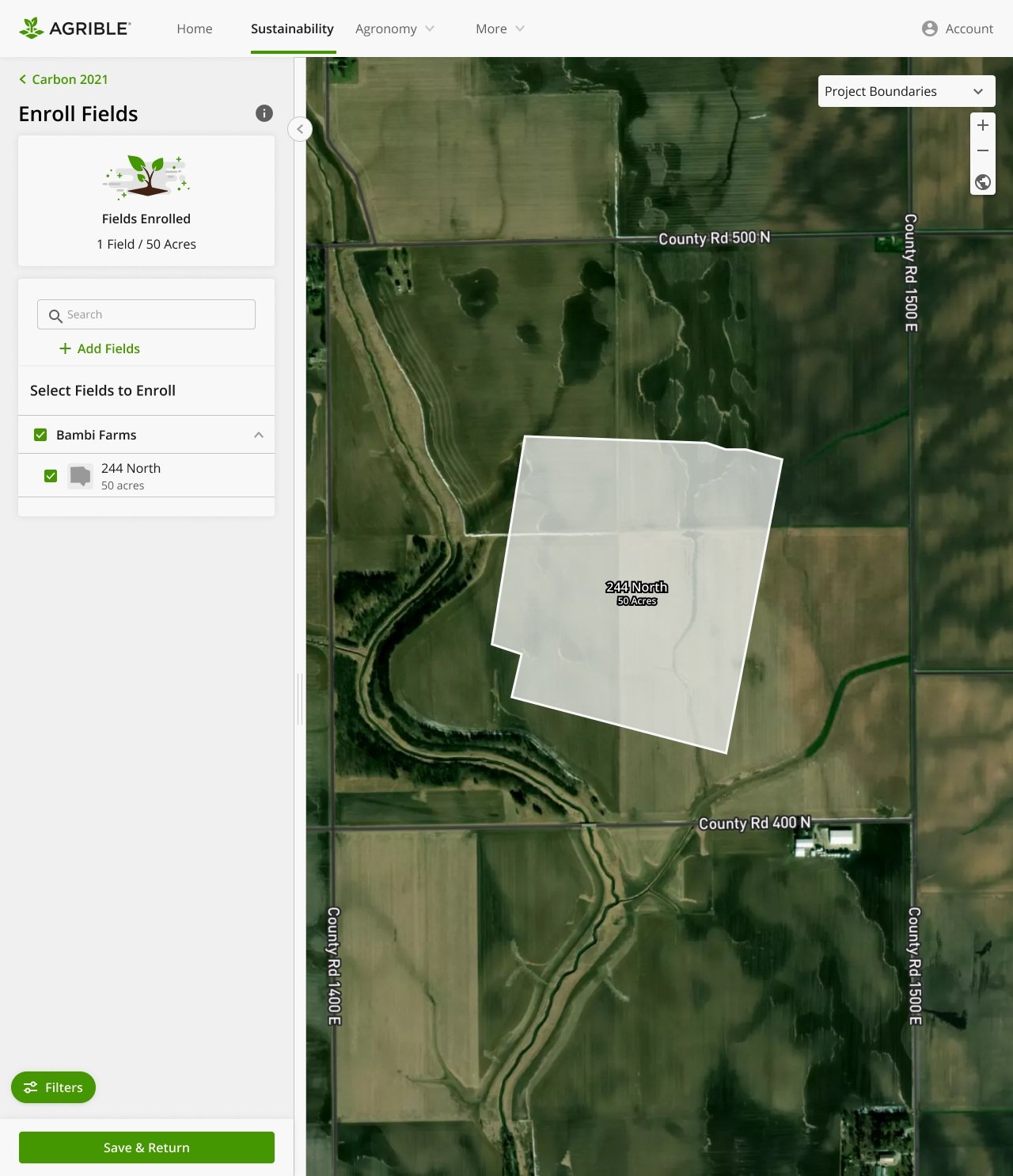
2 - Enroll Field
Scenario: You have joined the Ohio Carbon Project and have some time to work on the next step. You own field "244 North" on "Bambi" farm which makes it eligible for this project.
Task: Add the field "244 North" to the "Ohio Carbon Project." Let me know when you think you have completed the task.


Recommendations:

The revised design
1

The stepper was perceived well, and all participants were clear about the number and order of steps.
Working with the map to start drawing the boundary was not perceived as intuitive and most participants found this part to be challenging.
Most participants wanted to scroll to zoom, but they had to click. (This was due to limitations of the prototype)
Some wanted to enter the name of the field before they start drawing. (This was due to limitations of the prototype)
2
3
5
4
3. The success message after creating a field was misleading for most participants. Many thought that they were done with enrolling their fields, even though they had just created their fields and not enrolled yet.
4. It was not clear to some what they would return to after clicking on “Save and Return”
(The design was modified halfway through the usability test since the cause of the task failure was clear and the solution needed to be tested.)
5. Consolidating the confirmation message for creating and enrolling a field decreased the amount of confusion significantly. All participants completed this task after this revision.
Overall, most participants completed this. Everyone completed the task after the revision.
This task was not rated so easy mainly due to working with the map.
There were two disaster cases (task failure with high confidence) that were due to double screen confusion. This was resolved with the design revision.
Consolidate the confirmation message for creating and enrolling a field.
Give flexibility to the way people can interact with the map and the form.

3 - Build Rotations
Scenario: Imagine that you have enrolled three fields into the Ohio Carbon Project: "244 North", "340 East", and "Bambi." These three fields have the same crop rotation of Durum Wheat, Soybean, and Sweet Corn.
Task: You want to create a crop rotation for these three fields with this information:
Durum Wheat was planted on April 12th, 2020, and harvested on September 12th, 2020.
Soybean was planted on April 12th, 2019, and harvested on September 12th, 2019.
Sweet Corn was planted on April 12th, 2018, and harvested on September 12th, 2018.
Recommendations:


1


Some people didn’t realize that 244 North field is selected. They clicked on the “Build New Rotation” button (since that was the task) but didn’t realize they were making a rotation for 244 North.
All participants added crops to one field without any issues.
“Assign More Fields” didn’t appear like an obvious choice to some participants. As soon as they added crops, they wanted to click on ”Save New Rotation”. These participants struggled afterward to add more fields to the rotations, and this was the main cause of the task failure.
All participants created a crop rotation for one field successfully.
All participants who added fields in the first screen considered this task easy.
There was uncertainty about where “Save and Return” would take them and if their work has saved or not.
8

6
7
2
3
5
4
7. Some didn’t perceive this page as a confirmation message that they created the crop rotation for all three fields.
8. Participants who tried to add fields to the rotation that was already created, either failed the task or were not sure what they were doing.
“Define” confused some participants.
Like the previous page, it appears that participants didn’t really make connections between the farm/field tree and what they saw on top. They didn’t understand that it goes to the next field automatically - since they didn’t take any actions to make this happen, they were not sure what was happening or completely dismissed it.
Not a clear choice to some between selecting “Add to Existing Rotations” or “Build New Rotation”.
Overall, the task completion was lower than desired. Some due to prototype limitations and some due to adding more fields’ flow.
Some low confidence rating due to not being sure if they created the crop rotation for all three fields or not.
Change the flow in a way that users need to pick fields that they want to create a rotation for first, then crops.
Consolidate the field picker and rotation builder screens.
Instead of going to the fields that don’t have a rotation one by one, maybe show them all fields and ask them to pick the one they want to work on.
Show the rotation name, even if it’s just for one field, so if participants want to add a field to an existing rotation, they know what to choose.
Change the size or color of the field name on top, so it draws more attention.
Make sure the success/confirmation message is for all fields, even if they started with a specific field and added to it.
Change the word from “Define” a crop rotation to “Create.”

4 - Document Baseline
Scenario: You have created Rotation Group A in Agrible, which includes fields "244 North", "340 East", and "Bambi." Now you want to enter some data regarding the fertilizer that you applied to these fields.
Task: You want to enter fertilizer application data for 2020 Wheat in Rotation Group A, and here is the information you have:
- Fertilizer completion date: 04/31/2020
- Fertilizer type: Primary, Black Label I 06-22-00
- Fertilizer manufacturer: Generic
- Entry method: P-2; O-5 Amount
- Amount: 10 lbs/ac
Recommendations:
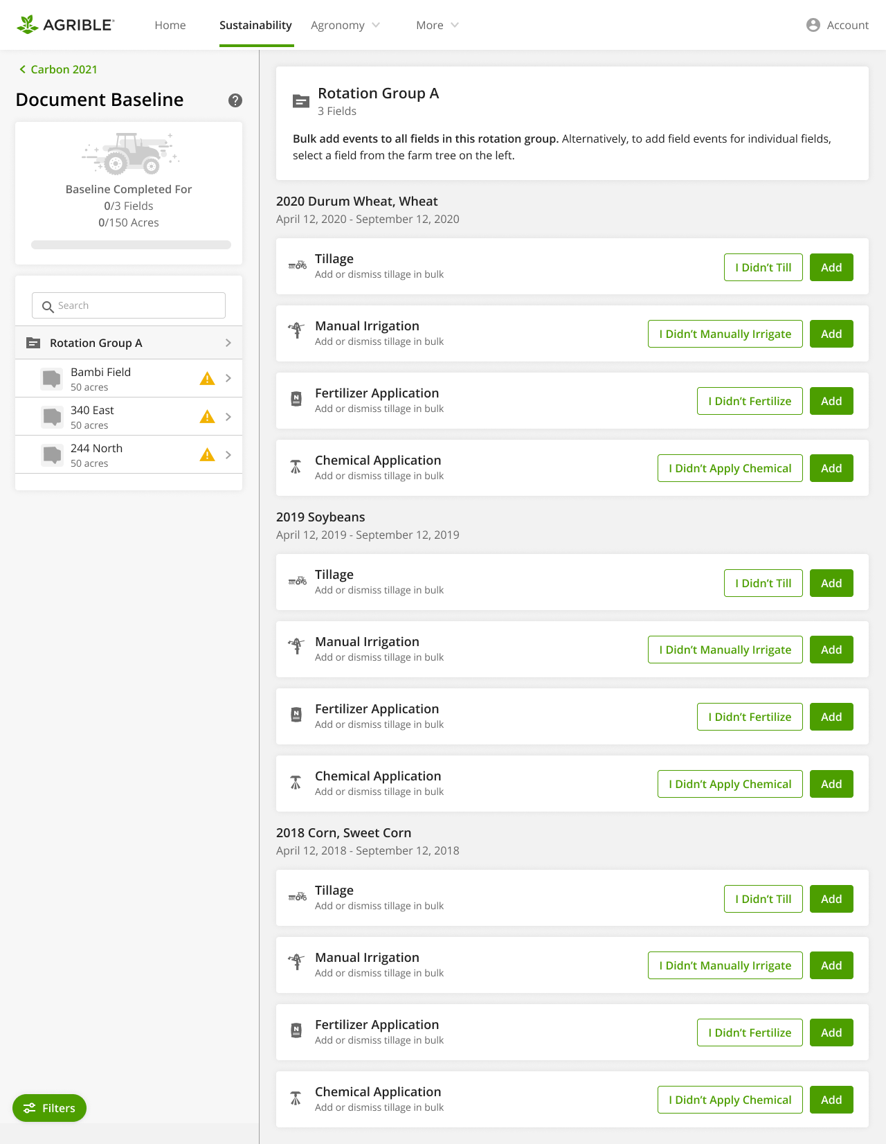
1


The walkthrough was perceived as mainly helpful, but the fact that they had to go through all screens before doing anything was found annoying.
As in previous pages, some people dismissed that the Bambi field was selected, and the information shown was the Bambi field’s information.
All the yellow highlighted notifications were found distracting and made some anxious.
Some didn’t find a specific flow here. They were not sure where to go compared to previous tasks (wherein a green button told them exactly where to click for the next action).
Participants found starting the task of adding the fertilizer (whether in bulk or by individual fields) easily.


6
7
2
3
5

4
5. Adding any attributes of the fertilizer and the event itself, both have the button that says “Add”. This caused some confusion among participants. They were not certain if they had to click on “Add” one more time to save the event. This was also the reason for one task failure.
6. The confirmation message was not enough for some participants to give them the confidence that they had added the fertilizer event to all three fields.
As we saw in previous tasks, some people didn’t notice the top area that says what they are working on, and this added to their uncertainty.
7. If participants go to the flow of adding fertilizer to one field and assign fields to that, they get back to the single field page, and that causes them not to be sure that they added the event to all three fields.
Most participants completed this task and found it relatively easy.
One disaster case was identified that the user didn’t click on “Add” to add the fertilizer event, but they thought they completed the task with high confidence.
Keep the walkthrough, but let people exit from it if they wish and make it accessible for future needs.
Make calls to action that result in different things more distinguishable. In this case, change the final “Add” button into “Add the fertilizer event” or something similar.
Make a global change to the box that shows the field(s) that users are working on. This needs to stand out from the rest of the page.
Make more alignment between the actions that users take and the confirmation message.
Establish a clear flow, prioritized by the actions users need to take.


Next steps:
1.Refine and Rank
Refine the design workflows in response to feedback and rank adjustments by their level of severity and impact.
2.Dig Deeper
Consider the possibility of conducting a navigation study, like tree testing, to gain deeper insights into the mental model of our target users.
Thank you for reading my case study!