E-Commerce Website
Card sort + Tree test

Background
Nutrien, with 2,000+ retail locations spanning North and South America and Australia, is a key player in the agricultural sector. Central to its technological advancement is the Digital HUB, a platform launched in 2018 that has rapidly evolved into a vital tool.
Simultaneously, for Nutrien’s salespeople and their clients/farmers, the HUB offers a dynamic toolkit enabling the creation of service plans, quotes, contracts, work orders, and valuable customer insights. Simultaneously, farmers leverage the platform to manage finances, make payments, and access agronomic information, transforming it into an essential asset for daily operations.
The Digital HUB's journey is marked by continual growth, with ongoing additions of features and capabilities. It stands as a testament to Nutrien's commitment to innovation, driving efficiency, collaboration, and precision in the agricultural industry.
Intro:
As our team expanded and various departments collaborated to overcome challenges, the need to enhance our navigation became apparent. We found it imperative to add more elements to our website's navigation system. Recognizing the necessity for optimization, we initiated a comprehensive navigation testing phase on our rapidly growing website. In the following sections, I will guide you through the specific tests conducted on the salespeople's side of the website.

Problems
Goal
1.
Bounce Rate Conundrum: Analytics spotlighted heightened bounce rates in specific zones, sparking a hypothesis around a potential mismatch between users’ mental models and the current navigation.
2.
Terminology Turmoil: Ambiguity surrounds the labeling and terminology of specific features.
Elicit and comprehend user expectations and mental models for website navigation, establish industry-standard labels for features, and optimize overall findability to enhance the user experience.
3.
Feature Placement Dilemma: Internal discussions revealed discord among team members regarding the placement of certain features.

Tools:
UserZoom
Miro
My Role:
Senior UX Researcher
Study design
Recruitment
Synthesis and report

Team:
Two (2) UX Designers
Two (2) Product Managers
One (1) UX Director

Timeline:
Planning: 1 week
Study design: 1 week
Recruitment and launch: 2 weeks
Synthesis and Report: 2 weeks

Methodology:
Study Sample
12 Participants
Format
Unmoderated
Tool
UserZoom
Methodology
Tree test
We used this method to evaluate a hierarchical category structure, or tree, by having users find the locations in the tree where specific tasks can be completed.
Survey
Surveys with open-ended questions were key to gathering diverse perspectives on specific items, offering valuable insights into how people perceive and understand them.
Card Sort
We utilized this approach to aid in the design and evaluation of the site's information architecture. Specifically, we opted for a closed card sort based on our predefined goals and hypotheses.
Study design:
Card Sort
Survey
We asked participants to provide answers to some open-ended and some close-ended questions.
What would you expect to find under a category that's called "Input Programs"?
What do you think the item "Approve Fields" means?
What would you call an item that contains quotes, contracts and inquiries?
Weather is a subset of…
Agronomy
Sales
Products
It should be its own menu option
Other

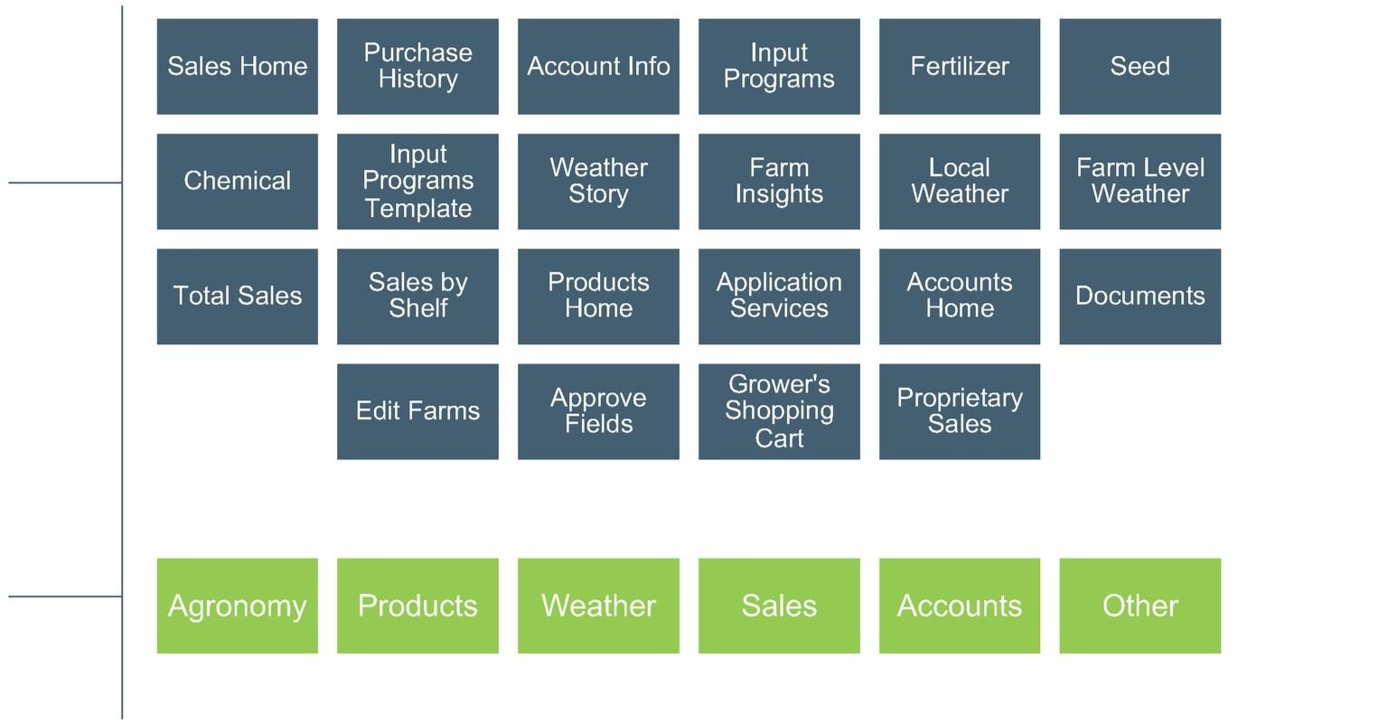
Cards: 22 of which participants were asked to categorize.
Categories - Buckets into which cards were grouped.
Other - To account for black sheep.
Tree Test
We instructed participants to explore the proposed tree structure with the aim of accomplishing a specific task outlined in the given question.
Where would you go to find…?
Where would you go to confirm…?
We asked participants to put cards under predefined categories based on their expectations.

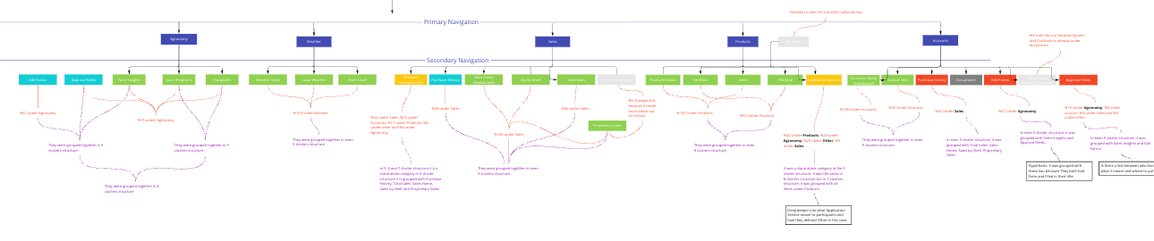
Group Analysis
In the group analysis section, you'll find both groups: those that underwent changes in navigation, including shifts in placements and names, and those that maintained consistency. We ensured that both the changes and the lack of changes align with users' mental models.
Agronomy
The word Agronomy is a common term amongst crop consultants.
To be added:
Approve Fields
Edit Farms
Application Services
Rename Input Programs to Crop Planning.

2
↪
Accounts
To be added:
Grower’s Shopping Cart should be accessible via Accounts as well as Sales
To be removed:
Purchase History (moved to sales)
Edit Farms (moved to Agronomy)
Approve Fileds (moved to Agronomy)
Products
No change: The results proved that this is the correct grouping and labeling
Application Services should be accessible via Agronomy as well.
Weather
Both weather’s position in the overall hierarchy (top level), and its child nodes were confirmed.
↩

1
Sales
To be added:
Purchase History
Documents (Quotes and Contracts)

3
↩

4
↪

5
↩
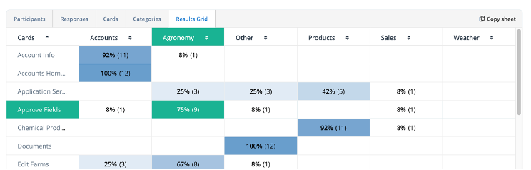
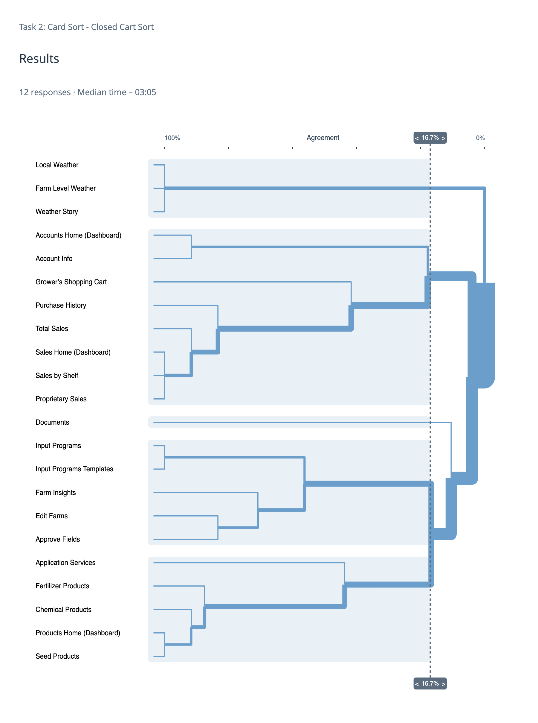
Card Analysis: In reaching final decisions regarding the placement and labeling of each card, I employed various analysis methods. Firstly, I leveraged the analytical reports generated by UserZoom, outlining the data representations and how they informed the decision-making process, as presented below. Secondly, I utilized Miro to juxtapose results for comparative analysis and employed it as an affinity map for survey questions. Screenshots for reference are included. It's worth noting that not all cards underwent deployment in card sort, tree test, and survey; some cards were exclusively tested in either the card sort or tree test, while others underwent testing through all three methods.

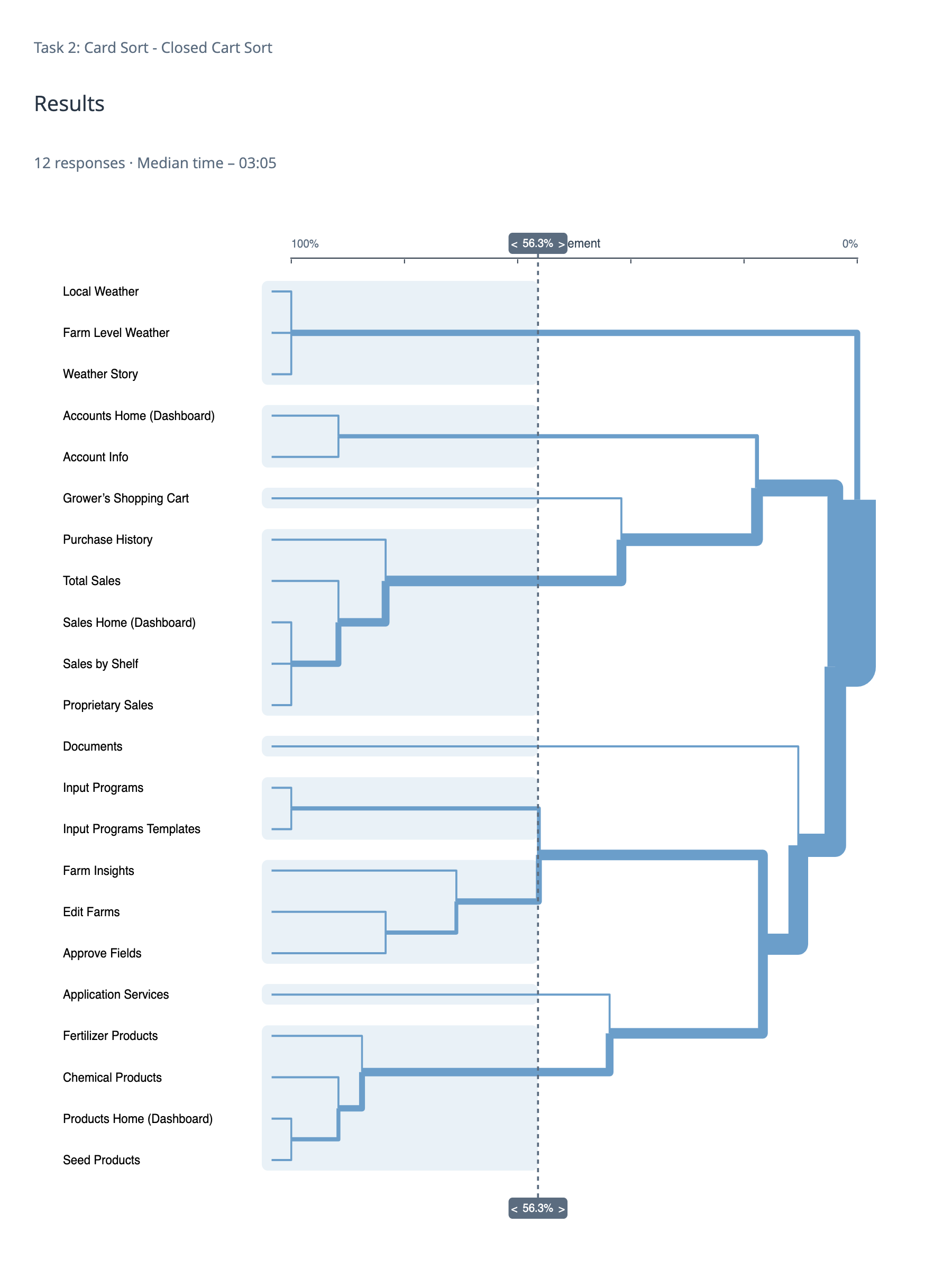
Card Sort
Card Analysis
Dendrogram - The quintessential cluster analysis output.
The more times an item is grouped together with another item, the more similar they are.
The more similar they are, the closer in proximity they appear on the dendrogram.
Results Grid - Shows you what percentage of participants put a specific card under a specific category.
Tree test
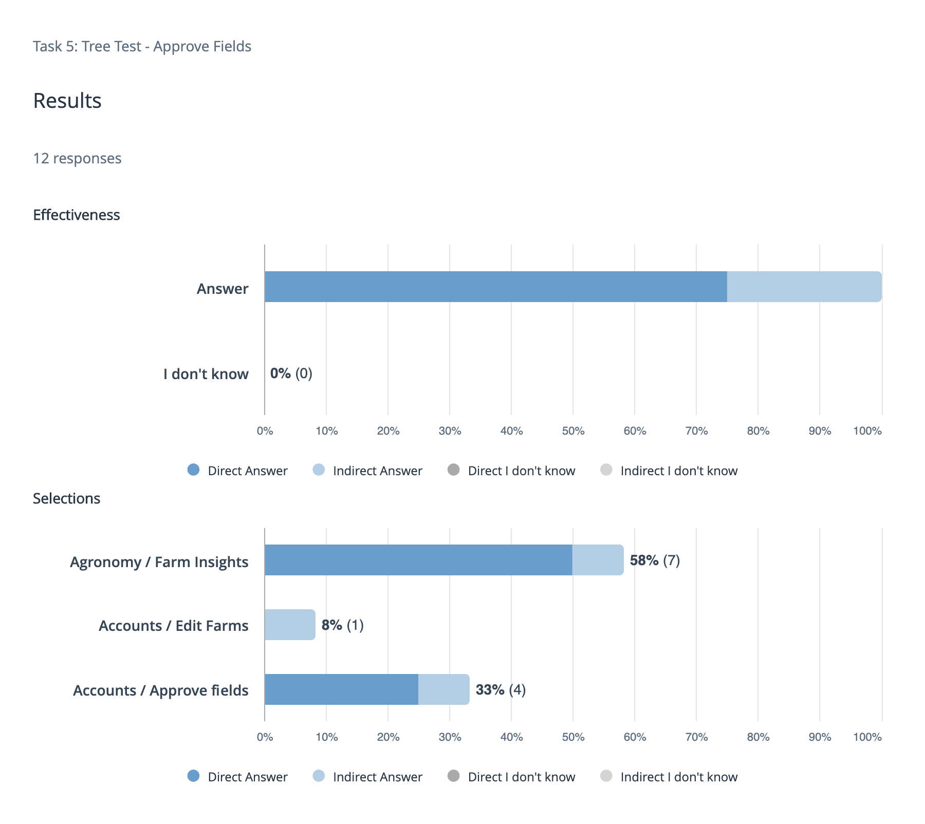
Effectiveness and selections - Shows the number of correct answers obtained and the corresponding percentage for each final selection.
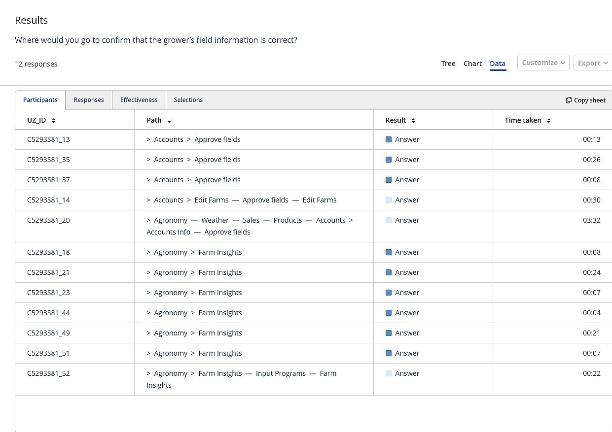
Path - Illustrates the route participants took to arrive at their final selection.

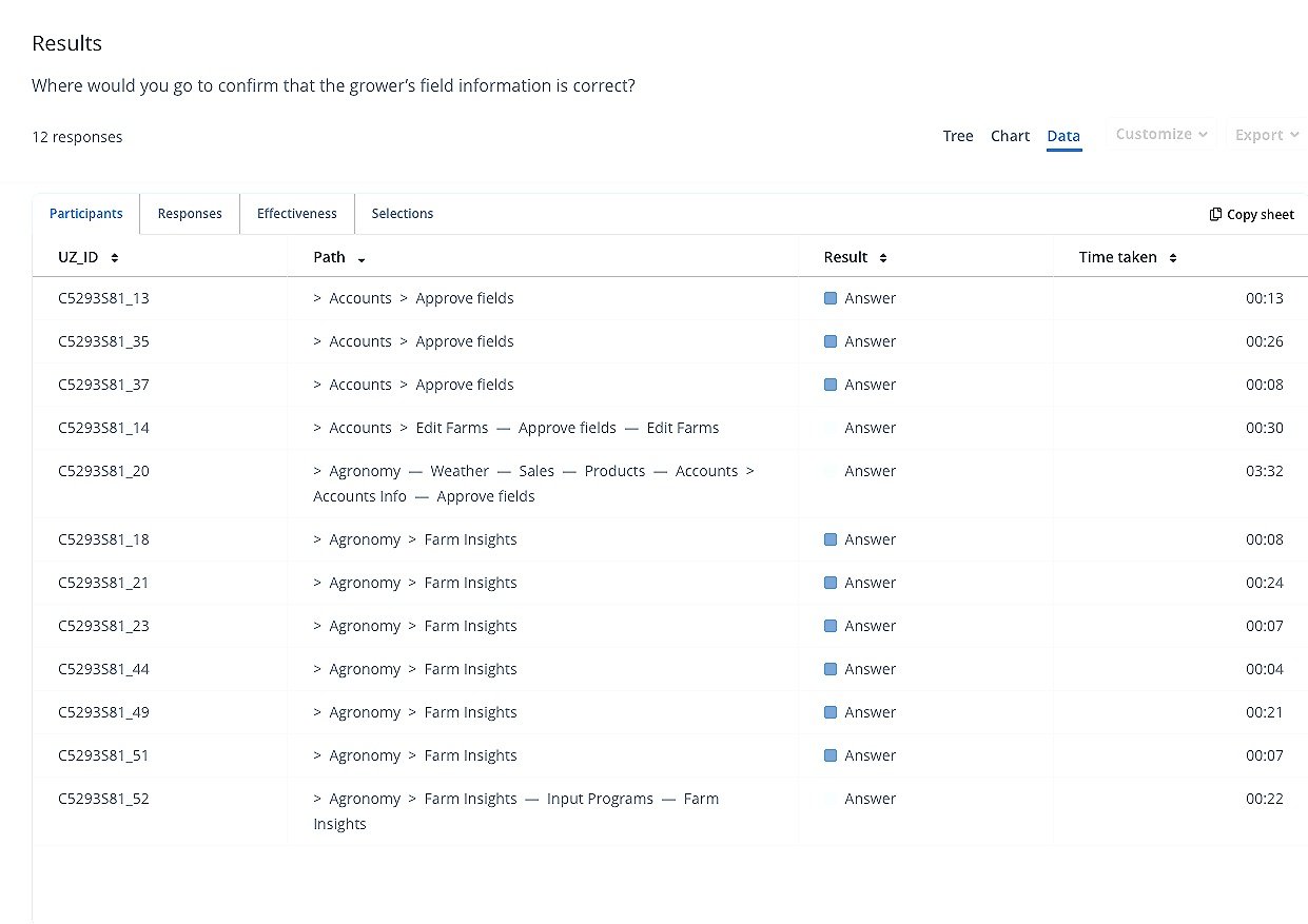


Card Analysis Example:
In this section you can see how I synthesized one of the cards that was tested using all three methods. It was pretty similar for all the 20+ cards.
Approve fields
What do you think Approve Fields means?
100% of participants who defined Approve Fields correctly categorized it under Agronomy.
With 70% agreement, Approve Fields was grouped with Farm Insights and Edit Farms
67% (8/12) clicked on Agronomy as their first choice versus 33% who selected Accounts.
58% (7/12) chose Agronomy as the home for Approve Fields versus 41% (5/12) who selected Accounts.
“The customer is ok and approves parts of the portal with a key stroke. If its under Agronomy, I would think he approves a recommendation.”
“I would consider that to be active fields a grower is farming and a consultant is making a plan for.”
Tree test

“Fields that come over from Echelon. Approve the farm and field name along with the boundary.”
75% of participants (9/12) put Approve Fields under Agronomy.
Card Sort
Survey
42% ( 5/12) of participants defined Approve Fields correctly.
42% (5/12) defined Approve Fields wrong.
16% (2/12) defined Approve Fields in between.
Synthesis:
While the reports that UserZoom created were crucial for understanding what happened to the data, I still needed to put information side by side to make the correct call. I used Miro board for this and here are some snapshots of my messy board